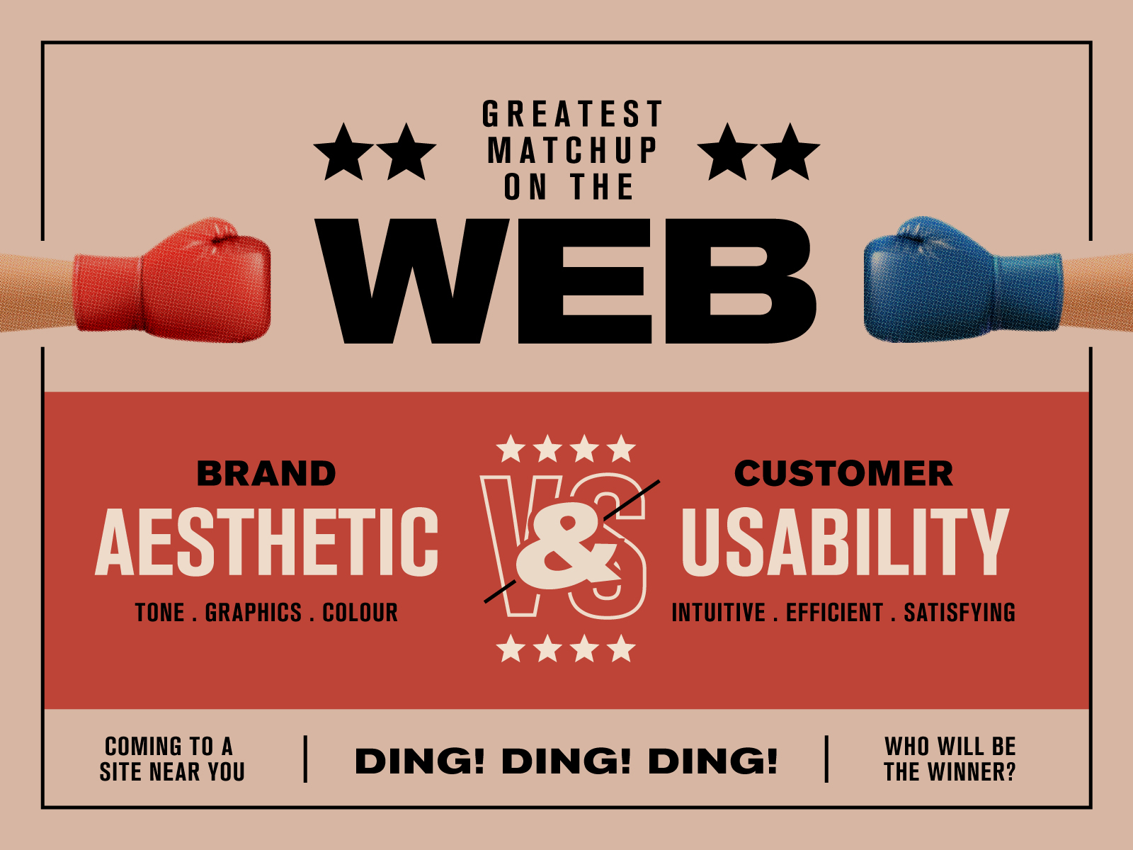
Visual appeal plays a big role in the user experience of a website, however, it shouldn’t ever compromise usability or functionality. Here are 5 quick tips to consider when designing your next website.
1. Don’t F@*k with the navigation
2. Too much whitespace can kill your website
3. Interactive elements should look interactive
4. Adjust your brand colours for web
5. Visual hierarchy improves readability
1. Don’t F@*k with the navigation
Treasure hunts might be fun for Easter, but not when it comes to your website’s navigation. If users don’t notice a navigation menu, they won’t use it. Unfortunately, it’s a little too easy to overlook this tip and many opt to hide their navigation in plain sight in the vein of ‘minimalism’. Discoverability is cut almost in half by hiding a website’s main navigation.
Avoid hiding your navigation behind an icon. Hamburgers are irresistibly delicious at the best of times, but lettuce think of your website’s users. Sorry for the pun. Hamburger menus might be common practice on a mobile, but they can easily get lost on larger screens like a tablet or desktop.
Another way to think of it is to resize your menu to the size of the screen: larger menus for larger screens.
Furthermore, always use familiar locations for your navigation. This is typically the top of the screen for most websites or the left hand side for dashboard layouts. Anywhere else is just adding an unnecessary barrier for your visitors.
2. Too much whitespace can kill your website
If a user can’t tell that there is more content below where they are, they probably won’t look for it. This isn’t to feed into the neverending debate about the invisible fold. Most users will instinctively start scrolling not long after the page loads (C’mon guys, it’s not the 90’s anymore). No, this is more in reference to excessive whitespace between containers or passages of content.
Too much whitespace can easily confuse the user into thinking they’ve reached the end of a page. So it is important to scale your spacing according to the screen size. When designing with whitespace, consider whether it is helping direct the users attention to important information, or concealing it. There’s a fine line between creativity and overwhelming minimalism.
3. Interactive elements should look interactive!
This should go without saying, but here goes: interactive elements should look visibly interactive. This means that they should look like something you would want to click, tap, or drag. Avoid camouflaging interactive elements with background elements or blending links in with non-interactive elements.
If you think about buttons on an analogue radio, knobs were typically rounded and had textured sides to encourage someone to twist them. Buttons were also raised to imply that they could be pushed in. This is known as perceived affordance (the actionable properties of an object).
The internet has certainly moved on from skeuomorphism (elements that mimic the real-world), though, there are still a few techniques that can help improve perceived affordance of your website.
Make sure your interactive elements have a large enough tappable area for a large thumb. Add plenty of padding within the link and plenty of margin around the link to avoid accidentally hitting other interactive elements.
It doesn’t work for every brand, but adding a border around a button can make the world of difference. Same goes with rounded corners. This can be the subtle 8px curve, or full-blown circular sides. Another option is to, try adding an arrow icon before or after the words of a link. Finally, for a more subtle option, the conventional border-bottom always works a treat!
4. Adjust your brand colours for web
I can’t overstate the importance of providing enough colour contrast between background and foreground elements. This includes text on images or backgrounds, buttons, and other functional elements. It shouldn’t just be the developer’s job to make a website accessible. A designer has a major role to play upfront (but more on this in a later post). Before handing over your design to a client or developer, run it through a colour contrast checker.
The next point about colour is it shouldn’t be solely relied upon to communicate information. The best example of this is for errors. If we highlighted an input field red to indicate a user error, a user who is colour blind is going to miss it. You should always communicate information on the web in multiple formats. Consider the use of icons, patterns, or words as well as colour to convey information.
5. Visual hierarchy improves readability
Most users will scan a page before diving into the details. You don’t have very long to convince a new visitor that you have the information that they are looking for. A really strong and clear heading hierarchy is your golden ticket to selling your site.
Without reading the content, I like to scan my page and review whether I can easily distinguish the hierarchy of the page. A page title is most important and should be most prominent. Followed by a heading 2, 3, 4, and 5.
I like to think of headings as sectional summaries. Can I understand the gist of the page by only reading the top-level headings? Do I get the gist of the paragraph below by reading the heading above? Not all users want to read your war and peace on a topic and it is naive to think you can force someone to do so. Always give the reader a quick summation of what they’re in for with a clear heading hierarchy and plenty of headings.
It is also important to note that headings are NOT a stylistic choice for making your content look interesting. Avoid using headings out of sequence (H1, H3, H2 etc) as it can cause confusion for users that rely on assistive technologies such as screen readers.