

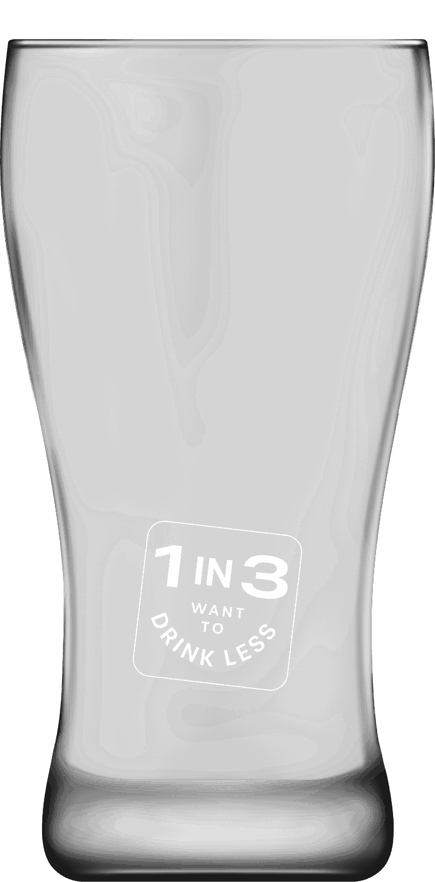
FARE briefed us on a harms-based alcohol campaign, but the real insight was tucked inside their research: 1 in 3 Canberrans who drink want to cut back. That’s a huge number of everyday people quietly wanting something different.
So the question wasn’t “how do we convince them?” It was “what’s holding them back?”
Site
Scope
Creative Direction
Logo
Type, Color, and Visual Language System
Copywriting
Web Design + Development
Social Media Templates
Brand Guidelines
So we began with the name

We partnered with Berlin Creative on strategy and naming because they bring the kind of sharp, outside perspective that spots the idea hiding in plain sight. And because naming really is one of their superpowers. They’re annoyingly good at landing phrases that feel culturally sticky and instantly human. And in Rich’s case, there’s just something about the way he names things — simple, cool, unforced. Exactly what a campaign needs when it lives or dies on how naturally it lands in real social moments.
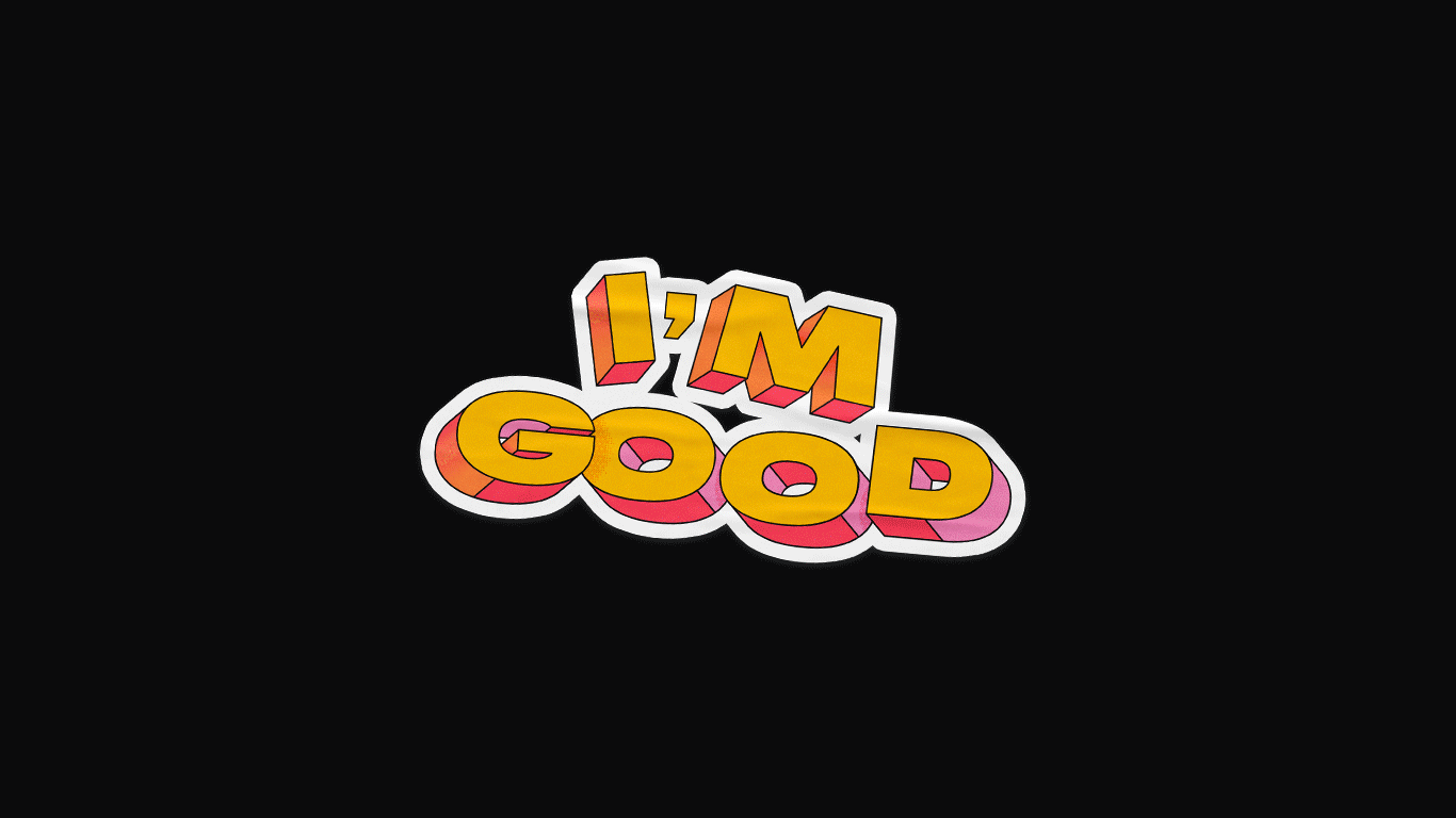
And in true Berlin fashion, they landed on the only name it ever needed: I’m Good. What people already say when they don’t want another drink — casual, warm, socially smooth. No lecture. No guilt. No fuss. Just a familiar phrase that quietly normalises opting out.
And we gave it a logo that carried that same vibe — ‘completely unbothered and quietly confident’. The slightly wonky letter angles make it feel relaxed and socially sure of itself, and the warm, upbeat colours keep it friendly without feeling preachy. And because the type has a bit of playful depth to it, the whole thing has just enough presence to say “I’ve made my choice and I’m good” — not loud, not defensive, just calm and self-assured.
“I’m Good” works because it’s what people already say — the logo simply bottles that unbothered confidence.
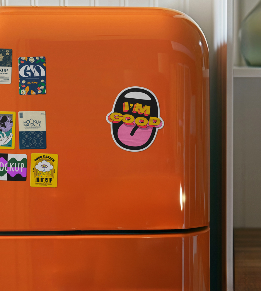
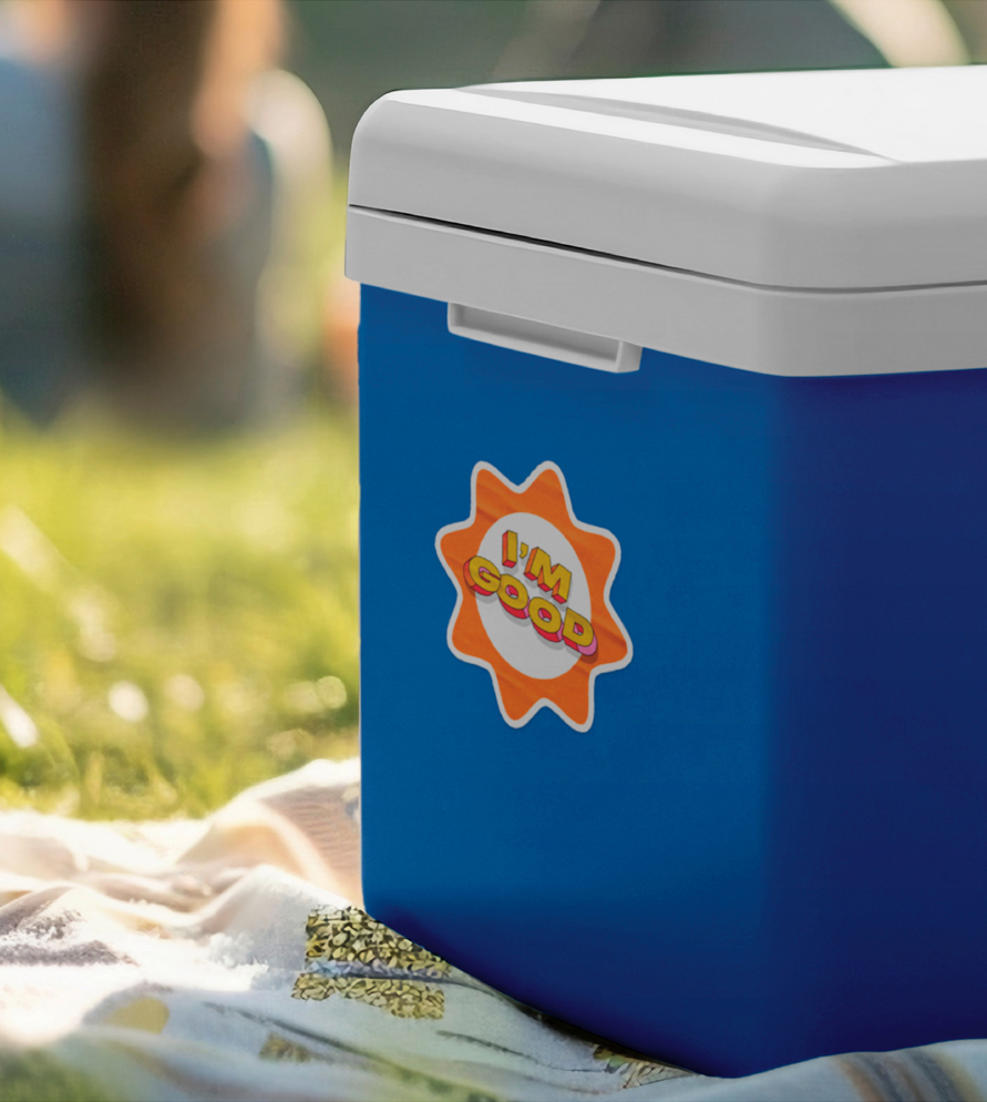
The logo is a sticker?
Yep!
From the start, we knew this campaign needed to feel human — not like a government PSA telling people what to do. When we explored visual directions, stickers kept popping up as this unexpectedly perfect medium. Not because “stickers are cute,” but because of what they do socially.
Stickers are one of the few things adults still use the way kids do: to claim something, express something, or quietly signal something about themselves. Does everyone remember those family stickers on the back of every car in the early 2000s!?
More importantly, stickers live on fridges, laptops, water bottles and eskies — the exact places where drinking decisions actually happen. And unlike posters or billboards, people keep them. They travel. They stick around (not sorry for the pun).
Yep! Because stickers live on fridges, laptops, water bottles and eskies — the exact places where drinking decisions actually happen. Plus they’re a silent way to claim something, express something, or quietly signal something about yourself.

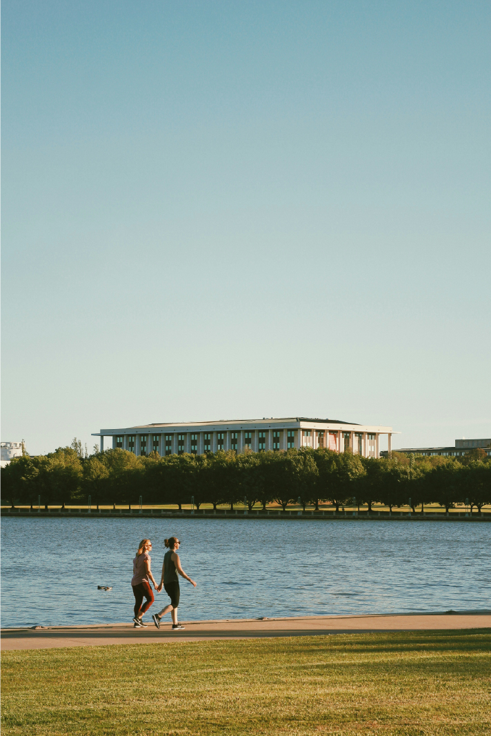
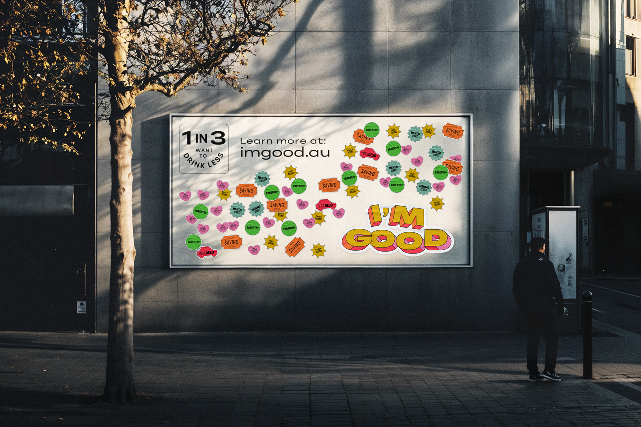
We showed Canberrans this is more common then you think
The more we leaned into it, the clearer it became that I’m Good needed to show people just how common this really is. The sticker idea made that easy — a low-lift way to spill into the real world through sticker sheets, pop-up walls, and public moments where you can literally see dozens of small choices stacking up. It turned a private decision (“I’m cutting back”) into something quietly communal (“heaps of us are doing this too”). And that became the point. If 1 in 3 Canberrans quietly want to drink less, what happens when you show people just how many others feel the same?

We turned a private decision (“I’m cutting back”) into something quietly communal (“heaps of us are doing this too”).
About the brand
The visual system is designed to feel like a casual nudge from someone you trust. The colours are bright and optimistic, the typeface has just enough character to feel friendly, and the soft paper texture adds that subtle, real-world warmth you never get from a typical government PSA.
The outline framing and sticker-inspired cues give everything a familiar, everyday feel — the kind of aesthetic you’d see on fridges, water bottles, laptops and community walls. It makes the campaign feel lived-in, approachable and casually confident.
It all works together to make I’m Good land exactly the way the name does: calm, positive, unbothered, and totally at home in the moments where people actually decide whether to drink or not.
The visual system is designed to feel like a casual nudge from a mate.
Then came the website
When FARE tested the brand direction, the audience loved it — but they also got very clear about what they needed next. They didn’t want more reminders that alcohol is harmful. They already knew that. What they were missing were practical, low-pressure ways to drink less without it becoming socially awkward or a major life overhaul. They wanted tools, tips, scripts, small confidence boosts — the stuff that helps in the moment.
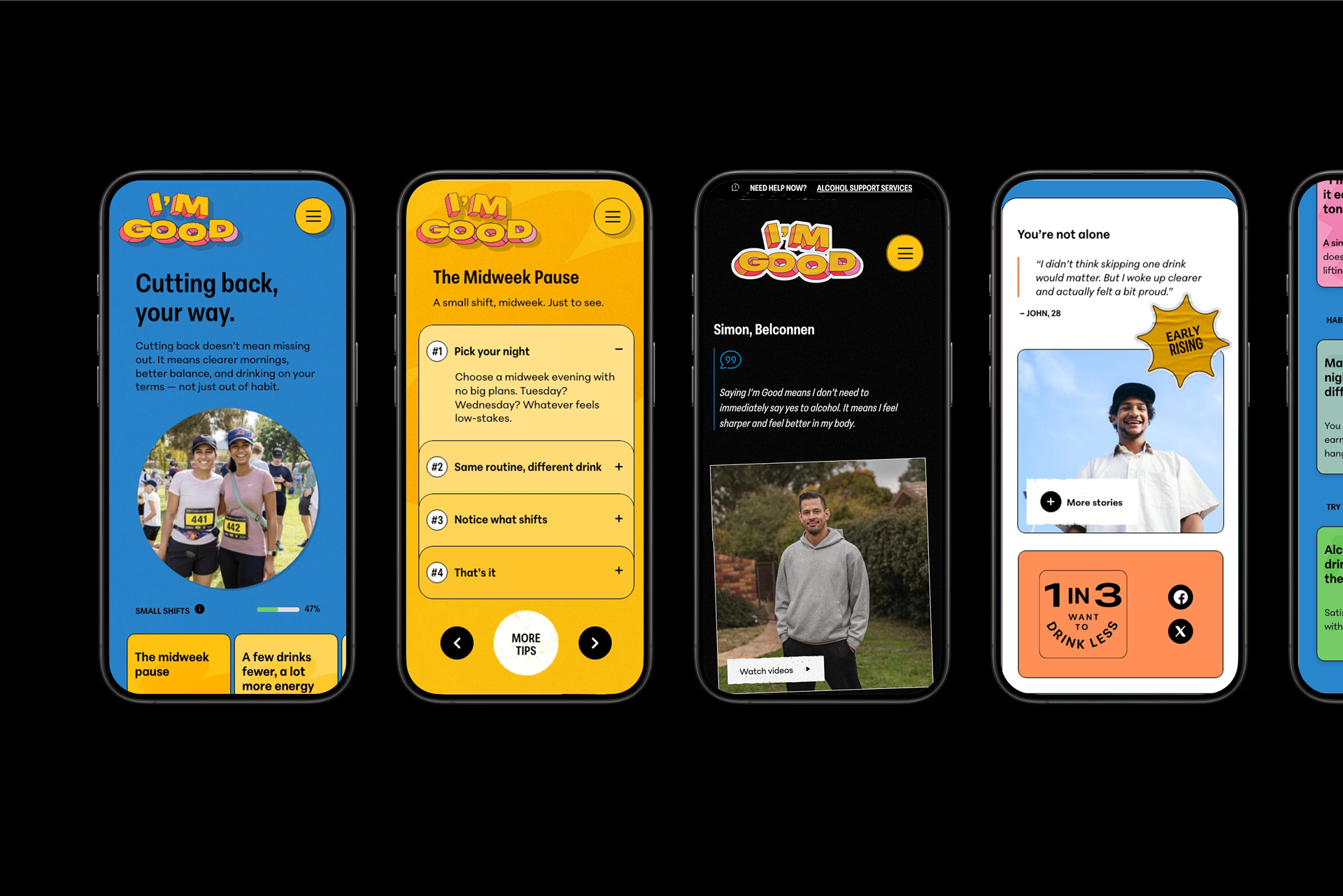
So NBF rethought the website from the ground up. Instead of a standard awareness hub, it became a real-world support kit for the exact moments people struggle with: dodging rounds, handling work events, slowing down without judgement, and backing yourself in social settings. We built behaviour-stage pathways, plain-language scripts, practical tips and zero-preachy guidance designed to help people make the choices they already want to make.
Testing revealed people didn’t need “why”. They needed “how”. So we turned the campaign site into a practical “moment toolkit”.
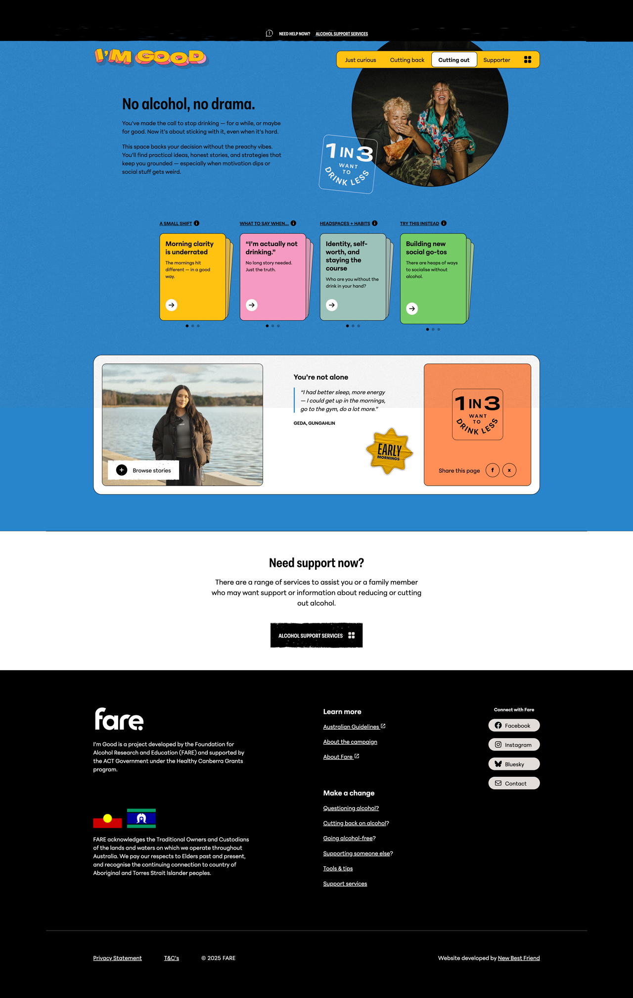
Content written for quick scrolls and small wins
We built the site around mindsets, not content types. Four mindset tracks written in the same language people actually use with friends. Inside each one is a hand-picked mix of small shifts, social scripts, headspace tools and “try this instead” ideas, all written by NBF. Seventy-plus bite-sized modules you can read in under 10 seconds. No long reads, no pressure, just casual “oh — that helps” moments.
The user experience (UX) follows the same logic. Clean, calm screens. One idea per module. One module per page. With clear next steps. It feels more like a reassuring companion than a campaign — something you can tap through while waiting for an Uber or hiding in the bathroom at a work drinks.
Together, the brand and product design work the same way the name does: familiar, casual and quietly empowering. Not telling people what to do — just giving them the tools and confidence to do what they already want to.
We kept it human: four content tracks, filled with 10-second tips, clean screens, and clear next steps — a reassuring companion for real-world moments.
Mobile first
Written for the distracted scroll.
4 starting points
Because cutting back looks different for everyone.
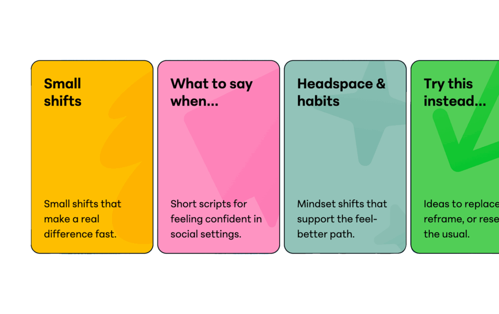
4 types of advice
Content written to meet people where they are.
We wrote
74
Tools, tips & advice
How it all came together
The final I’m Good campaign doesn’t try to fix drinking culture or talk down to anyone. It simply gives Canberrans a friendly, low-pressure way to navigate social moments where drinking decisions happen. A campaign people can actually use — on their phone, on their fridge, or in the middle of a conversation — long after the ads have stopped running.