This case study isn’t really about a “refresh”. Sure, it definitely took the shape of a new brand and website.
But for Toora, this work unlocked a whole new way to talk about how they’ve been holding the line for decades.
Client
Scope
Creative Direction
Logo
Type, Color, and Visual Language System
Copywriting
Web Design + Development
Document Templates
Brand Guidelines
What the brief told us
If you only know Toora for homelessness support, you’re not alone. It’s the most visible part of their work. The part the public sees. The part that tends to get talked about.
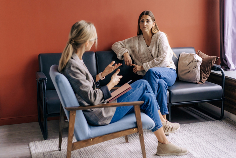
Toora’s work spans way beyond homelessness. They keep Canberra women and children housed, safe, supported, and connected through domestic violence support, mental health care, AOD support, outreach, and family services.
We began with alignment

This was Toora’s first proper branding process in 40 years. So for most of the team, it was new territory — no shared language, no framework to lean on, just decades of doing the work (and plenty of views on what mattered most).
Before we even thought about “a new brand,” we had to start with something more fundamental: getting everyone inside Toora talking the same language.
So part of our job was to equip Toora’s project lead, Kelli-anne (Engagement and Strategic Initiatives Manager), with the tools to guide that internal shift — keeping the process safe, clear, and purposeful. Not branding theatre. Real alignment.
The project anchor revealed itself in our very first discovery workshop. This was the insight that made everything else click: Toora has a dual nature. Two sides to the same coin. Fiercely passionate when advocating and calm and safe when supporting clients.
The problem was, the old brand tried to speak in both modes at once — to everyone, all the time. Which meant it wasn’t quite right for the people who needed it most: clients looking for safety, and decision-makers listening for urgency.
Toora’s first full brand process in 40 years began by building shared language and alignment, revealing a clear truth: one organisation with two modes — calm and safe for clients, fierce and urgent in advocacy. The new brand gives Toora the clarity to switch between them, without trying to speak to everyone at once.
Designed for duality
Once we’d named the dual nature, the visual system had one job: help Toora switch gears while still feeling unmistakably like Toora.
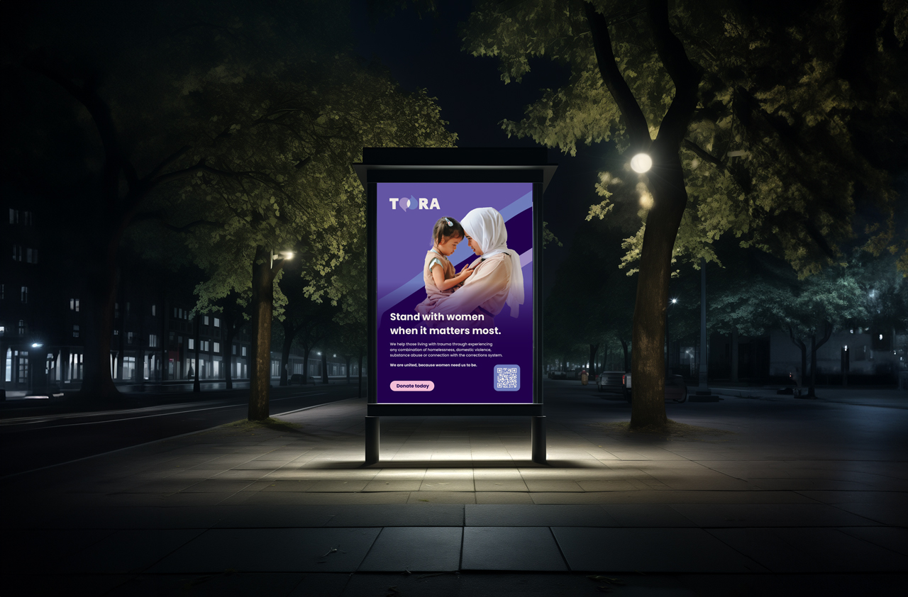
So we built an identity that can feel calm and safe when someone’s reaching out for support — and bold and unmissable when Toora’s out in the world pushing for change.
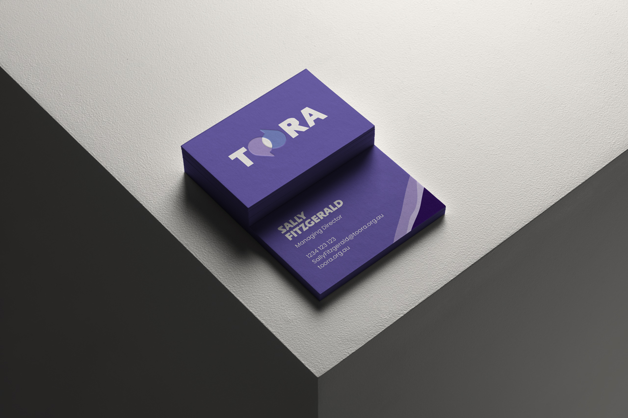
The new logo has a lot to say. Two overlapping speech bubbles that capture what Toora does best: client support and advocacy, working together. Services that connect instead of silo. Workers who stay alongside women as the story unfolds. And an intake approach that starts where it should — by listening to her story first, before anything else.
The new logo has a lot to say. Two overlapping speech bubbles that capture what Toora does best: client support and advocacy, working together. Services that connect instead of silo. Workers who stay alongside women as the story unfolds. And an intake approach that starts where it should — by listening to her story first, before anything else.
About the brand
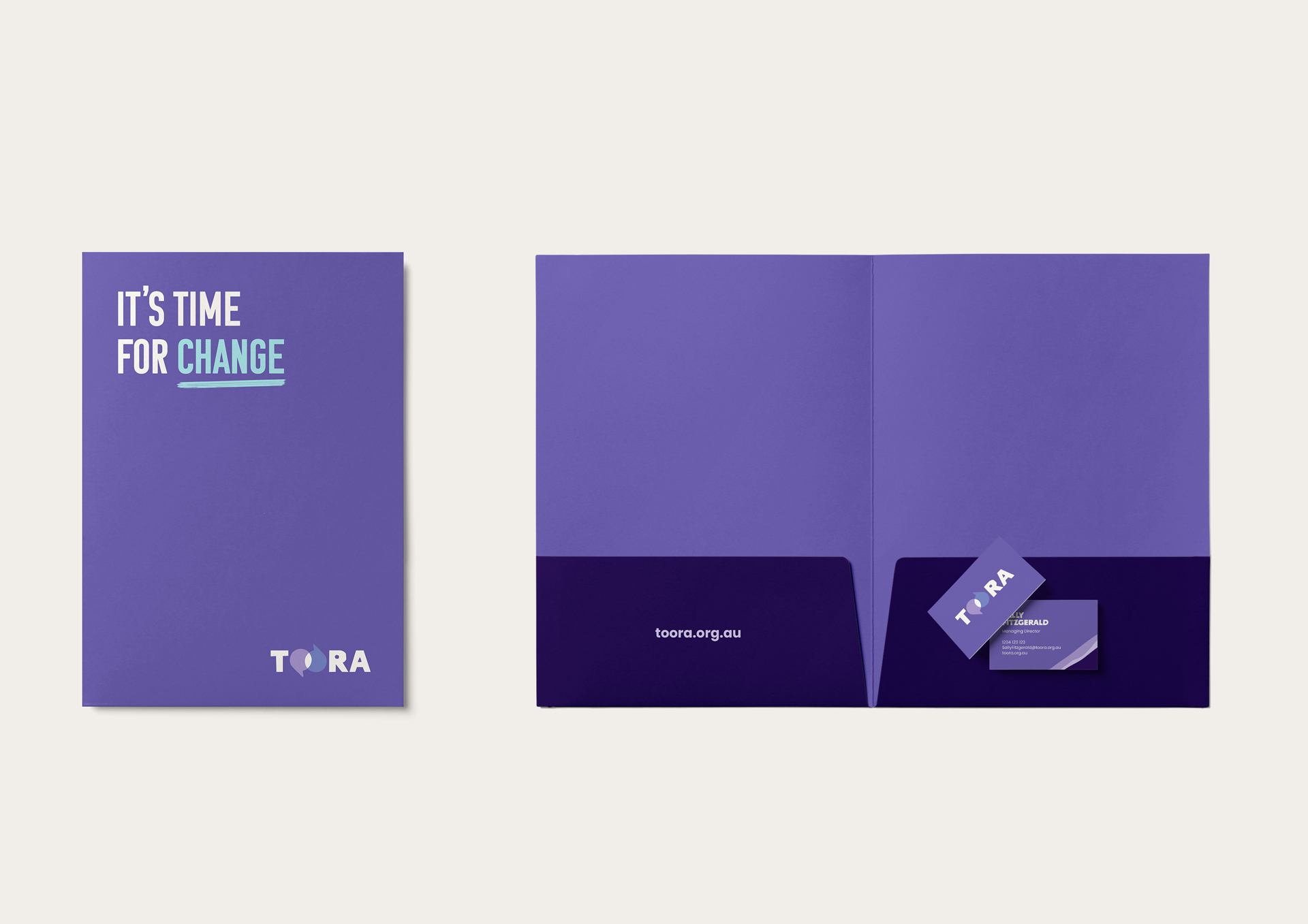
The typography does a lot of the heavy lifting. We chose two distinct hand‑painted‑style typefaces for headlines — one that carries Toora’s strength and leadership, and another that brings warmth and humanity. This pairing echoes the hand‑painted signs of feminist movements, linking the brand to Toora’s grassroots while keeping messages clear and approachable.
The colour palette anchors everything in Toora’s purples — confident, grounded, unmistakably Toora — with supporting tones and bright accents used sparingly to add warmth, clarity, and emphasis when it matters.
Then there are the cues that make it feel like advocacy without shouting. The Toora stripe element brings strength and leadership. The painted stroke lets Toora underline what matters (or strike out what doesn’t) in a way that feels human, not corporate.
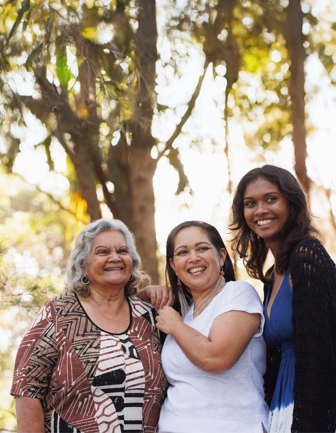
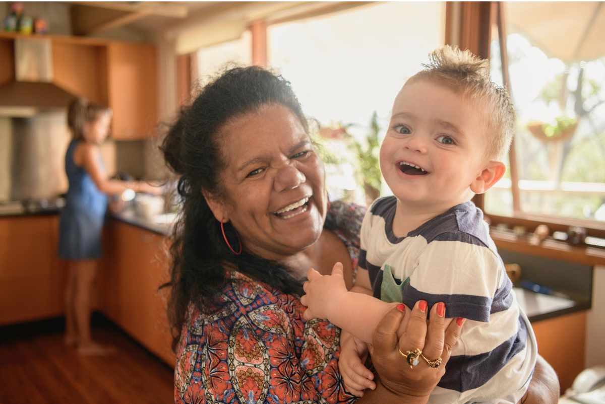
Even the photography follows the same logic: fierce when it needs to be fierce, nurturing when it needs to be nurturing — same organisation, same values, two clear modes.
All of it comes together into a system that’s flexible enough for real life (socials, templates, documents, and a website) but consistent enough that Toora finally looks and sounds like the full story.
A confident but human visual system — hand-painted type, grounded purples, and expressive cues — balances strength with warmth, letting Toora show leadership, care, and advocacy without shouting, across every touchpoint.

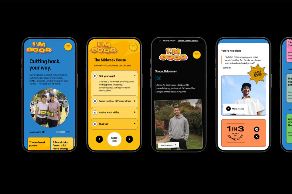
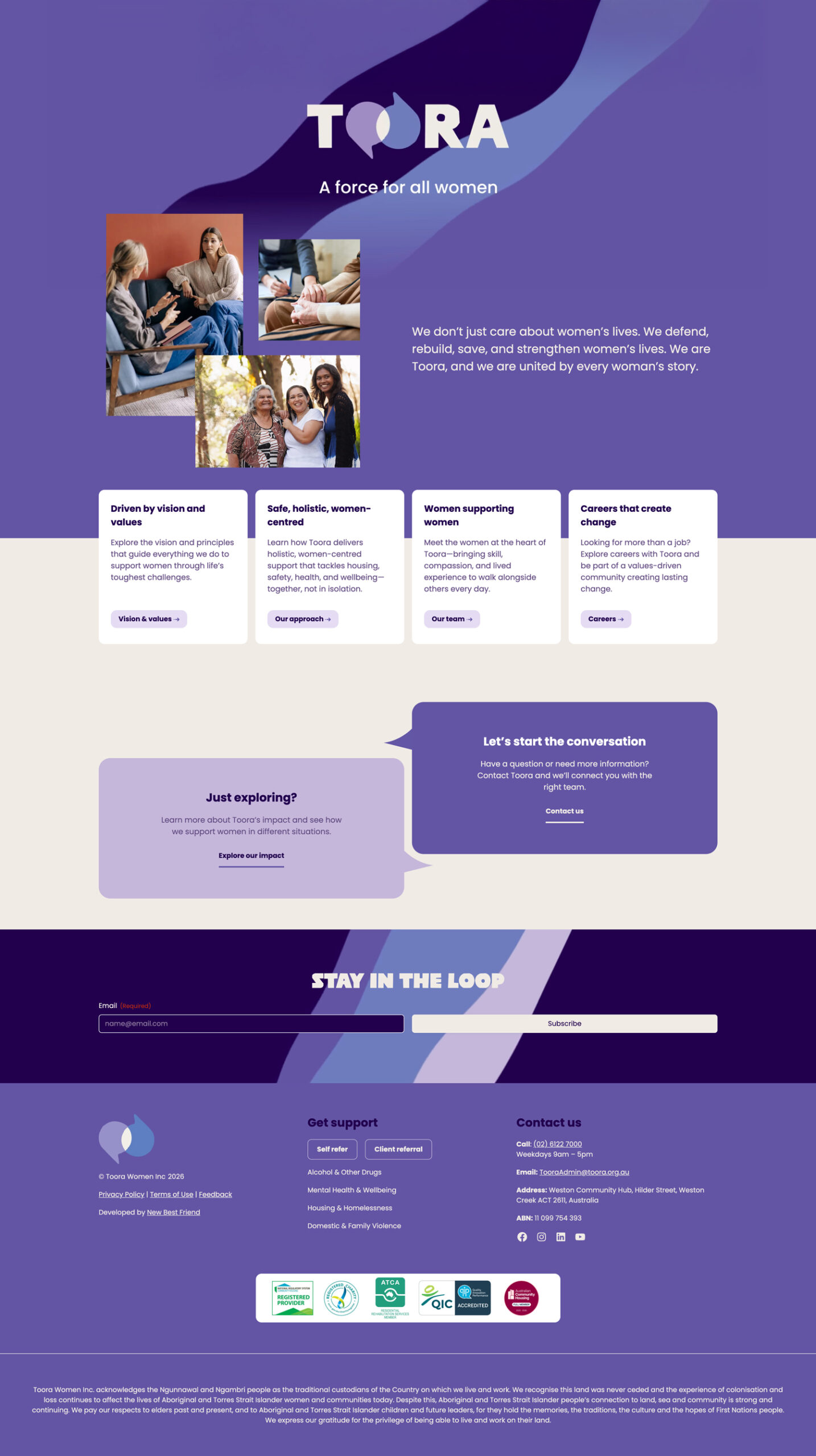
Then came the website
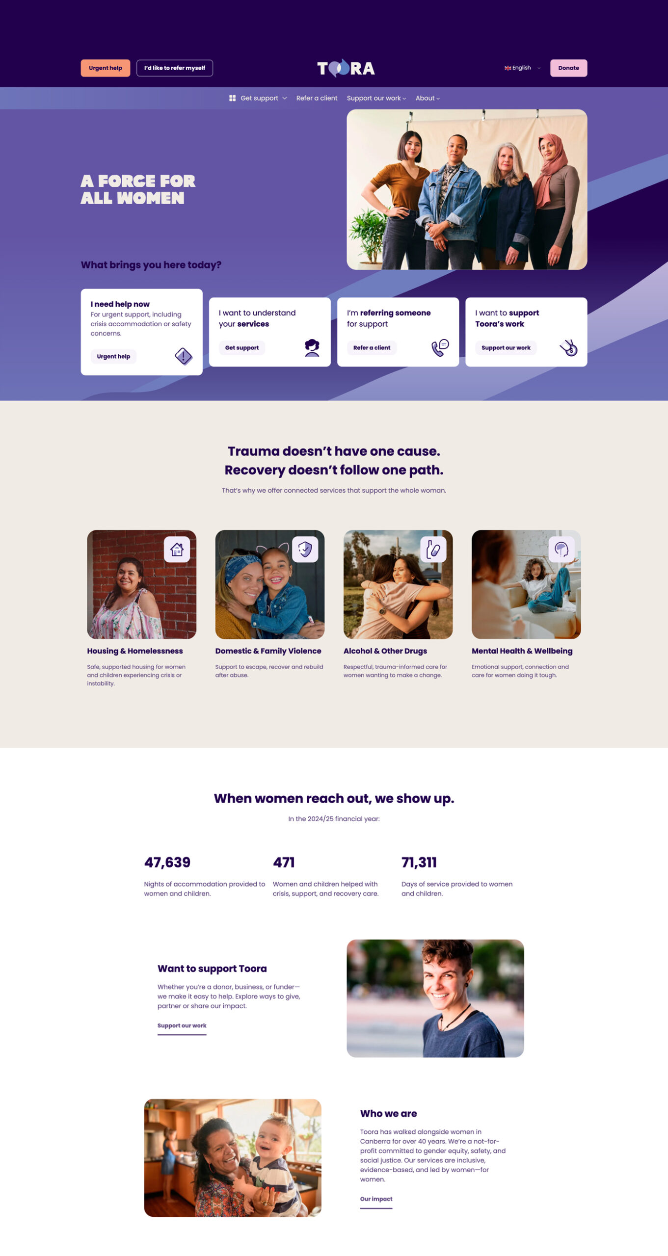
We started the website the same way TOORA starts every piece of work: by listening.
Before structure, before pages, before design — we focused on what each person coming to the site might need, want, or feel unsure about in that moment. Clients looking for safety. Workers and advocates looking for clarity. Decision-makers looking for urgency and impact. Supporters wanting to help, but not always sure how.
That thinking shaped the content strategy from day one. We ran scoping sessions across internal teams and program areas, then brought everyone together in a UX workshop to map the real journeys — not the organisational chart.
Real stories, not just services
The result is a site that leads with people, not systems. TOORA meets women where they are, listens first, and connects the right support around them — housing, safety, health, advocacy — as one joined experience, not a list of services.
At the same time, the site clearly speaks to TOORA’s broader world. It gives policy makers and partners the context they need. It makes advocacy visible. And it creates clear, human pathways for donations, goods, volunteering and partnerships — without turning care into a campaign.
Everything works together to reflect how TOORA actually operates: calm, respectful, deeply connected, and led by the belief that meaningful support starts with understanding the whole woman — not just the problem in front of her.
How it all came together
The new TOORA brand and website don’t try to be everything to everyone, all at once. They give women a calm, human place to start — and give advocates, partners and decision-makers the clarity to act. A system built to listen first, connect what matters, and keep working quietly in the background, long after the launch moment has passed.